Aesthetics and Technology
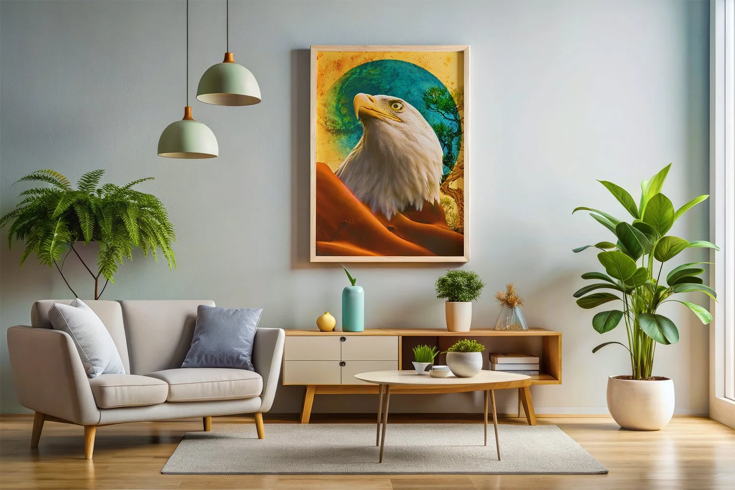
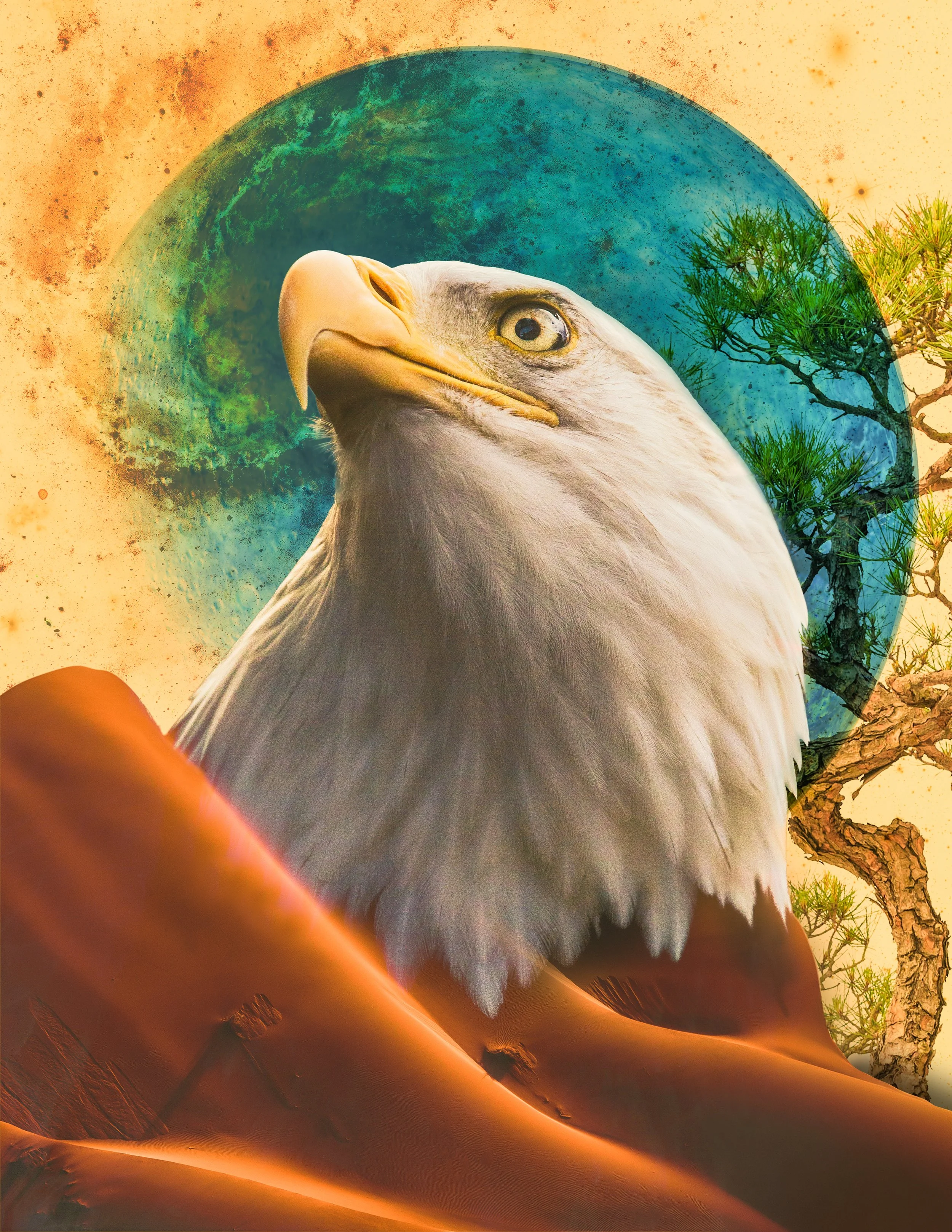
Desert Eagle
One aspect I always find challenging with fantasy compositions is selecting source imagery. Having good images is critical, and if you can’t find the right image, you’ll need to take your own, which can be time-consuming. Birds of prey have always been some of my favorite animals, and much of the inspiration I found myself drawn to used animals as the main focal point. Since this was a fantasy-themed project, I knew I wanted to add a sci-fi element to my final piece. I incorporated the planet and galaxies in the background and as texture. The sand reminds me of the Dune series, and the eagle serves as the focal point. Integrating the two seamlessly took experimentation, but I am happy with how it turned out. I wanted to use the beauty of God’s creation to compose something interesting, and I think I achieved that here. What I like about this piece is that it invites you to look deeper. At first glance, you may not realize that the dunes are, in fact, sand. They look like part of the wings. The same goes for the galaxy. The galaxy image I used looks like a brush-on texture, not the Milky Way. All images were sourced through iStock and composed using Adobe Photoshop.
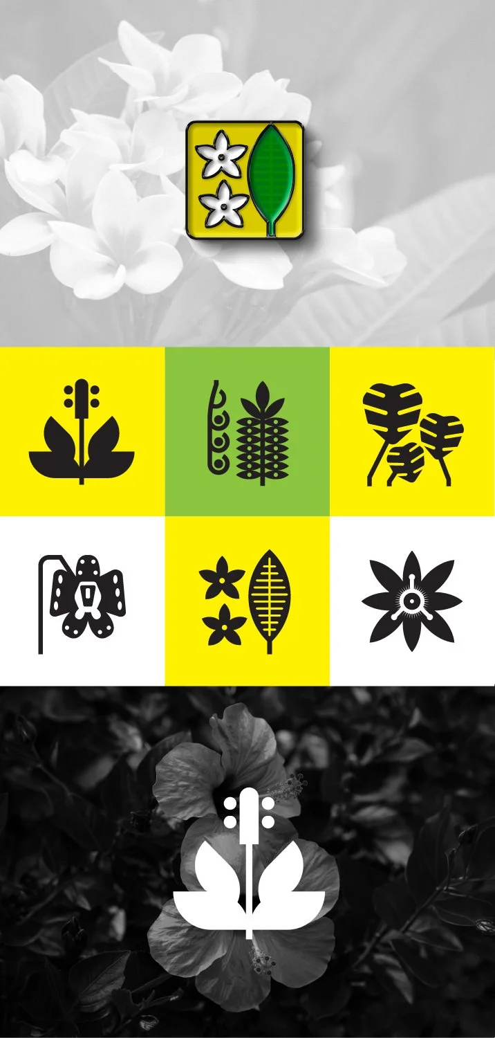
Tropical Plant Icons
For my icon set, I chose a tropical plant theme. My wife is part Hawaiian, and we often visit her family in Oahu. One of my favorite areas to visit is my wife’s cousin’s home in Manoa Valley. We often go for neighborhood walks where you’ll see exotic-looking plants of various sizes and colors. This awesome creation from God is where I drew my inspiration.
For each plant, I needed to identify what made the plant recognizable and unique. Was it the leaves, the pedal shape, or some other unique feature? Once identified, I could then focus my efforts on creating those features using basic shapes. I created my initial sketches by hand and vectorized the final iterations with Adobe Illustrator.